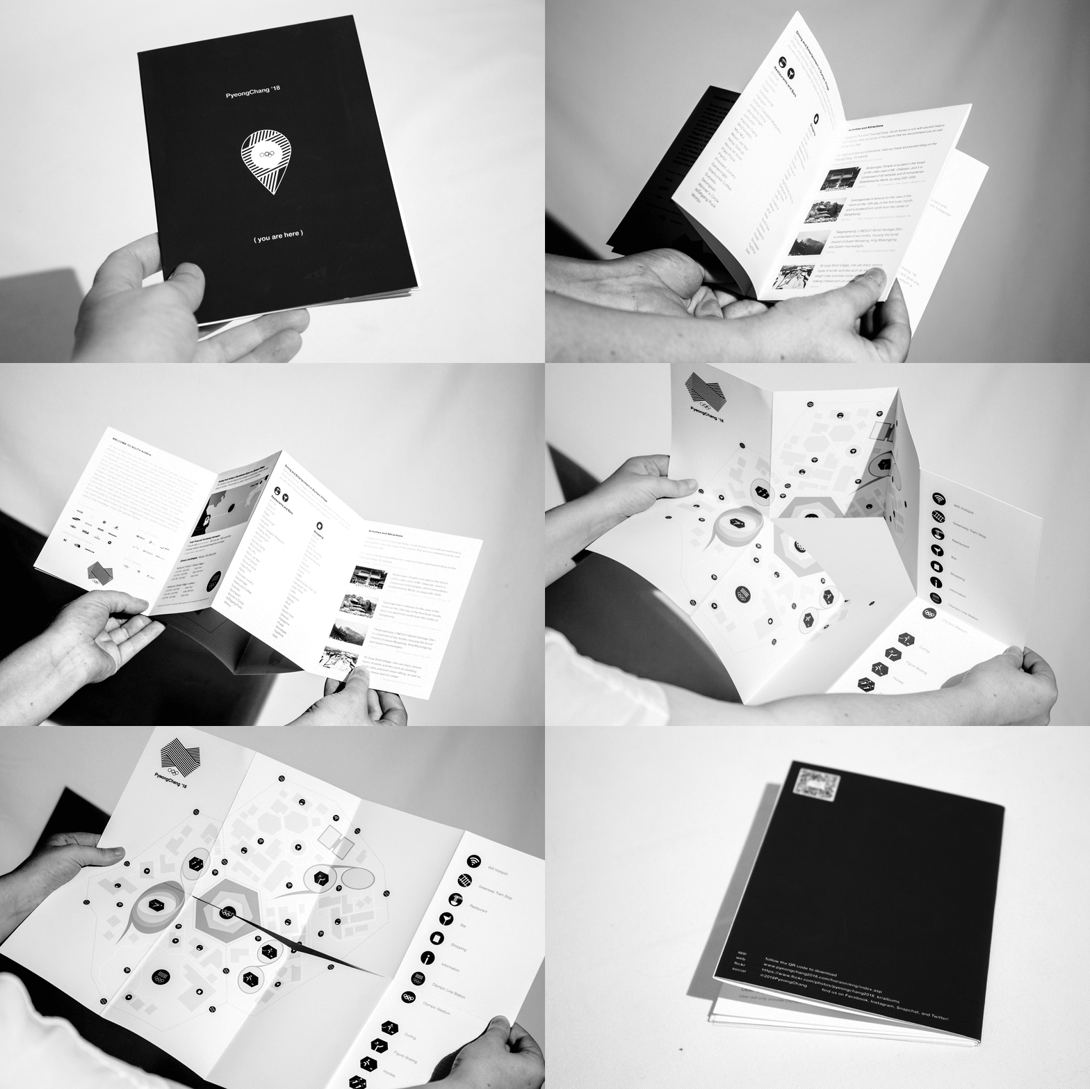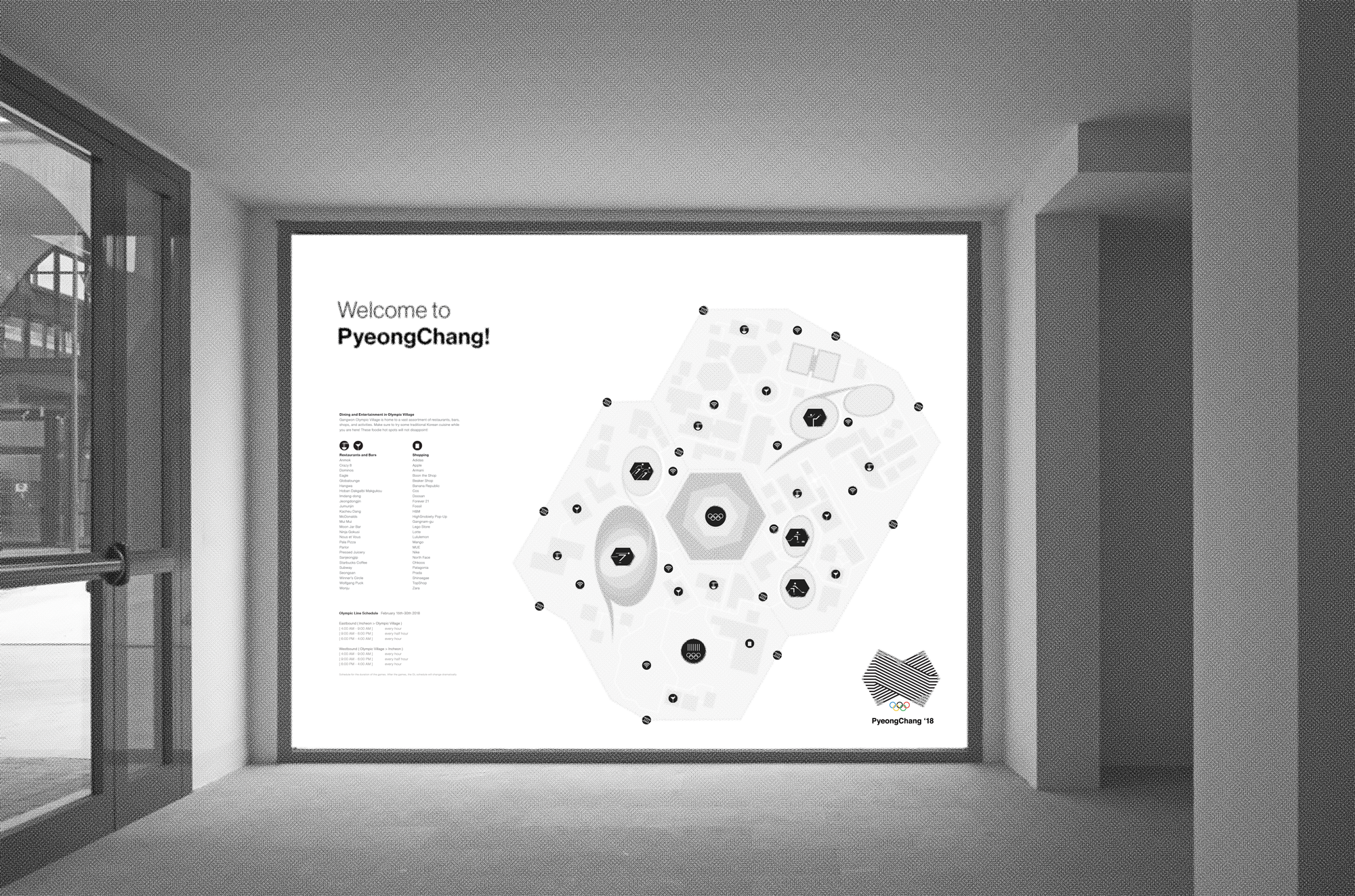
To create branding and way-finding visuals that bridge language barriers, cultural barriers, and national conflict of interest for the 2018 Winter Olympics, which will take place in PyeongChang, South Korea.
The PyeongChang Olympics are the first Olympic events to be held in Korea since the 1988 Seoul Olympics, which saw participation from almost all IOC member countries, including the USSR and the USA. The slogan for the 1988 Olympics was “Beyond the Wall” and represented harmony. It is no coincidence that South Korea has been chosen to host in 2018. The motivation behind this branding is conflict and unity. Student work.

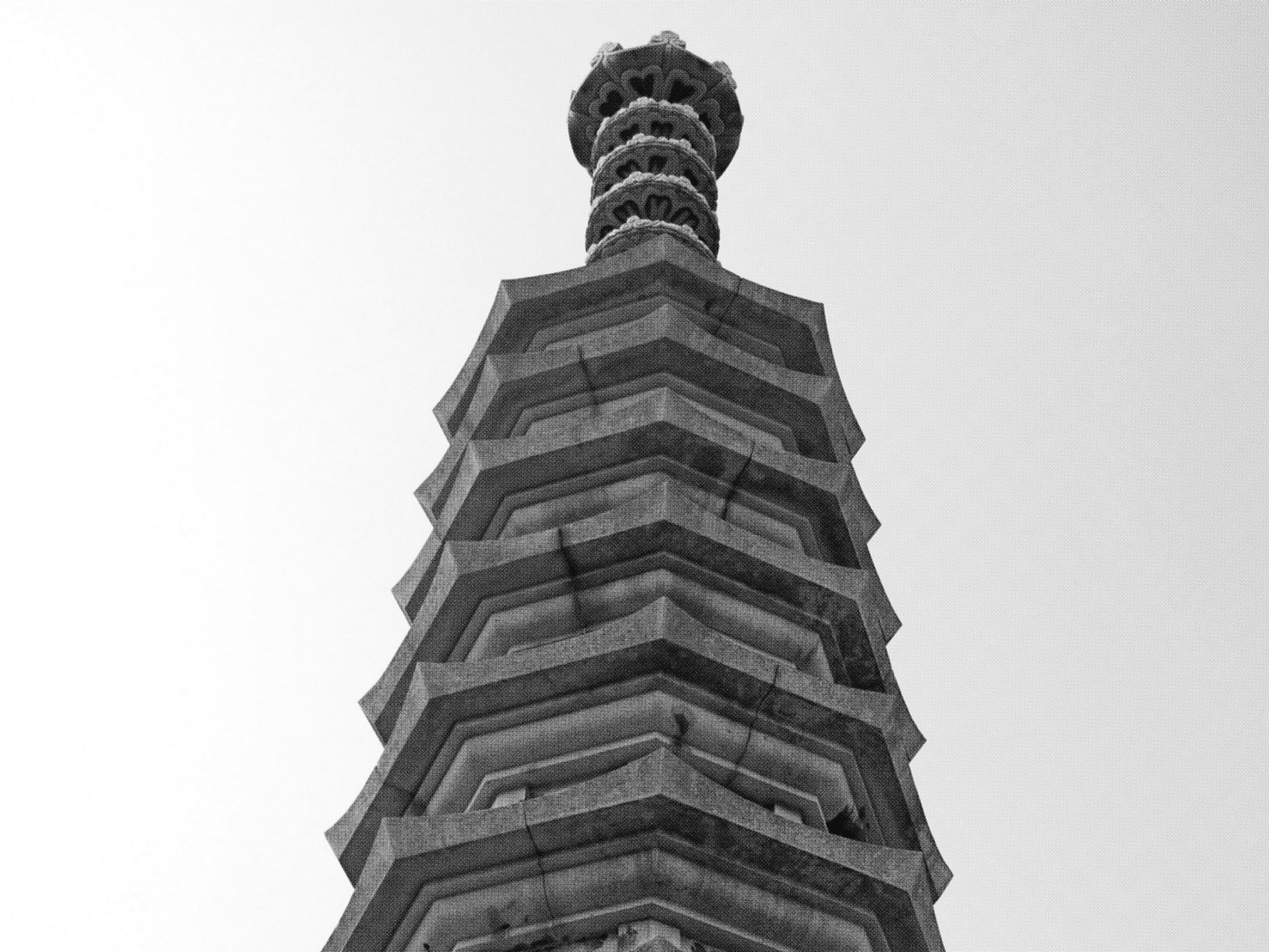
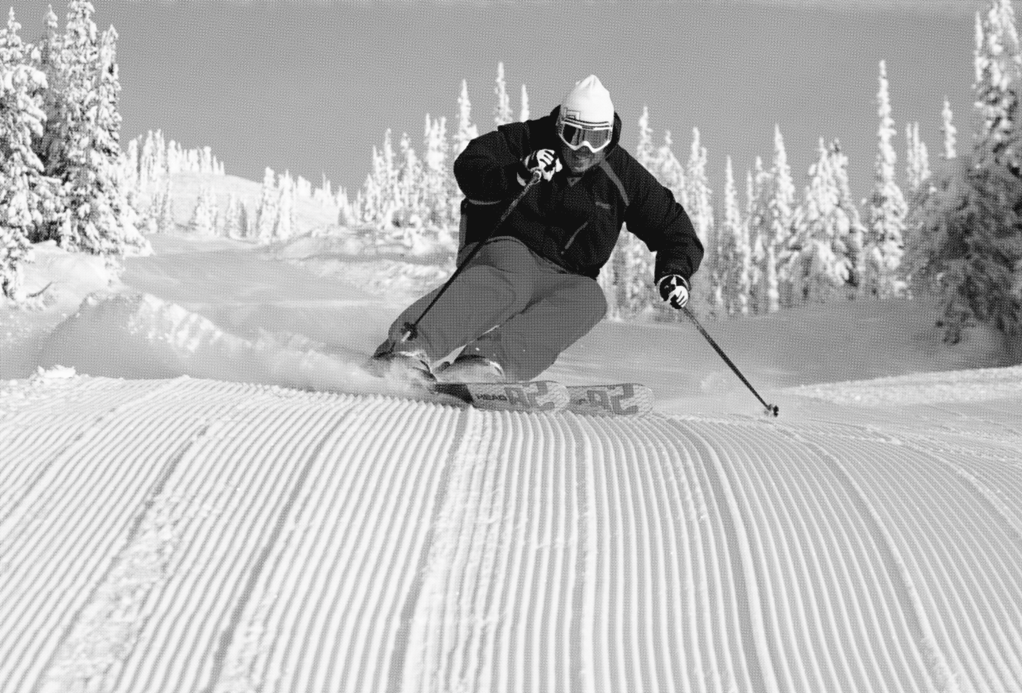
The aesthetic is inspired by the architecture of the PyeongChang Buddhist temples and the look of freshly combed snow. This logo solution creates a very powerful shape that is both grounded and in motion. The hexagonally crossing lines create a very dominating and confident aesthetic, which aligns with Josef Albers and Edward Tuffte’s law of proximity, where 1+1=3 or more. The negative space carries an equal amount of weight as the black lines. It is the balance in this relationship that creates a confident shape.
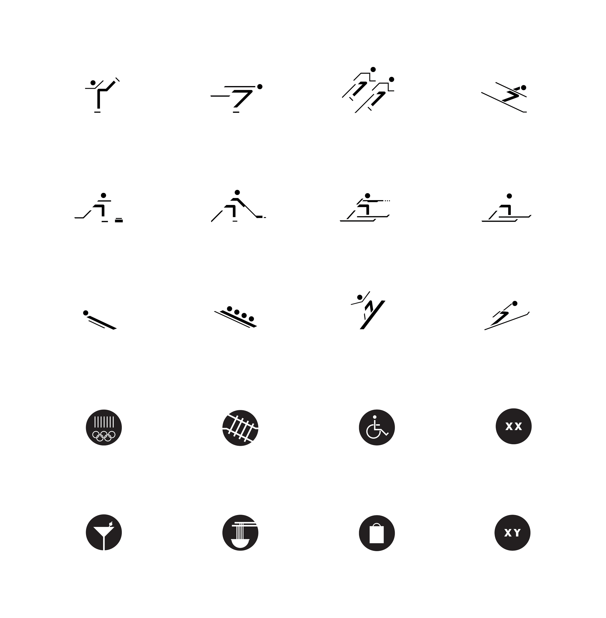
After creating the logo, I used the hexagonal shape and the crossing lines as a grid for the pictograms, which represent each of the Olympic events. Each pictogram is stripped down to only what is essential to convey the motion.