Tahwooo is an apparel & jewelry brand based in Seattle. Their designs are genderless, dreamy & minimal.
Brief
To create a branding for the Theresa Wu’s brand, Tahwooo and a sub brand for her professional portfolio. To develop a graphic style that falls at the intersection of her varied aesthetics and inspirations. Between her family names and social media, Theresa has multiple names she identifies with, all of which must be represented in her brand.
Mood & Inspiration
This mood board was created in collaboration with Theresa. She gravitated toward contemporary calligraphy and hand done logotypes and photography that is inspired by underground club culture and lo-fi tech. She also liked chaotic layered sketches and handwriting. There was also some editorial photography which is heavily saturated, romantic and ethereal.
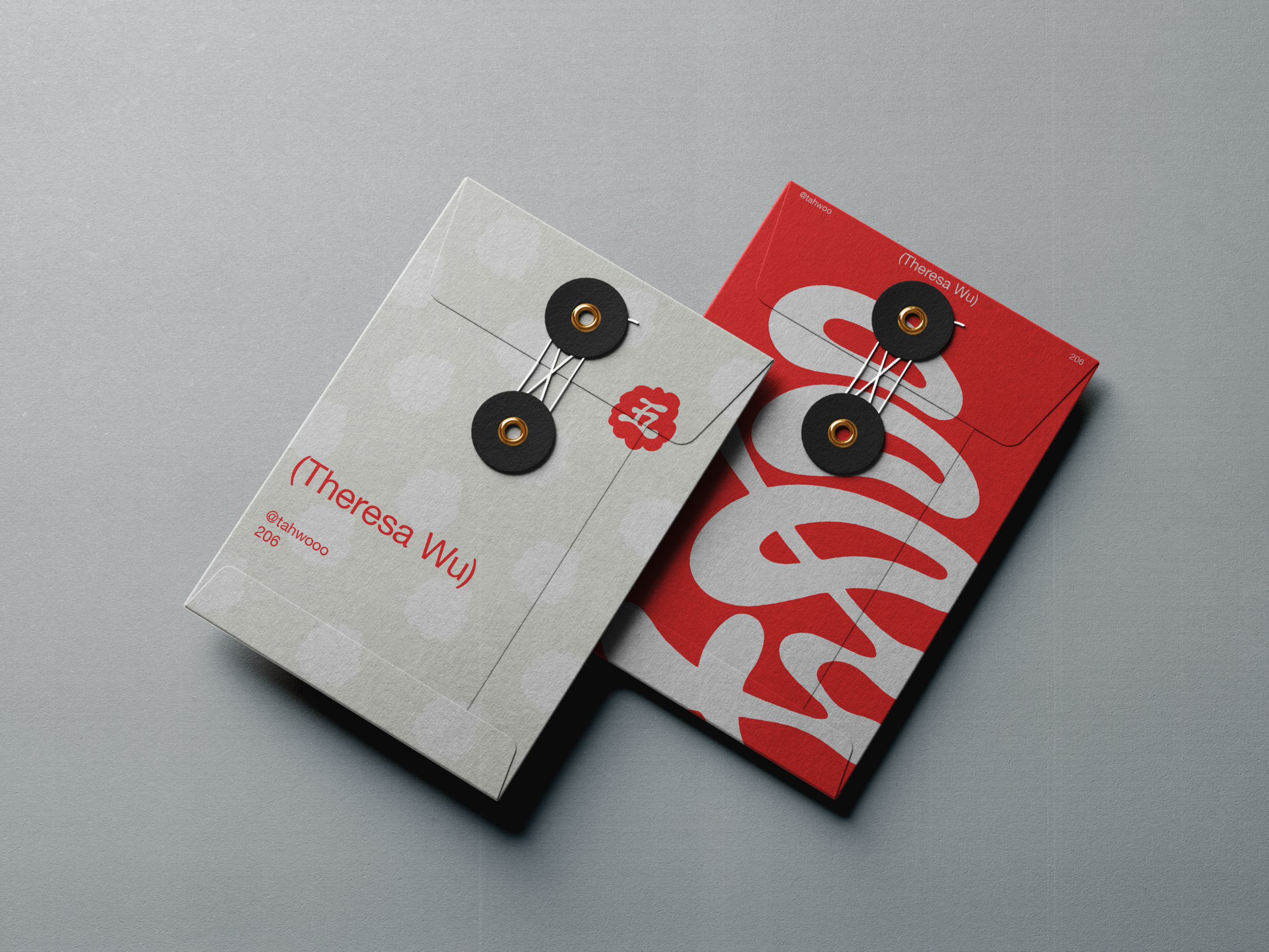
Logotype & Logomark
The Tahwooo logotype is playful and animated like her characters, yet minimal enough to pair well with her streetwear and tailored work. Her sub-brand Theresa Wu is a simple typeface solution which can stand alone or be paired with her stamp-inspired logomark.


Logo Clear Space
It’s important to ensure that there is a good amount of negative space surrounding the logo. This logotype is heavily stylized, so negative space ensures that the composition isn’t busy and the logo doesn’t feel crowded.


Scale
Each mark has a different minimum size to ensure that it is still legible. The only time that this minimum maybe broken is when the logomark is used as a favicon.
Logo Improper Uses
To maintain a consistent use of the logo, do not:
Pair the logotype and the logomark in a single badge
Do not pair the brand and sub brand in a single badge
Do not rotate the logomark, brand or sub brand logotypes
Typography Hierarchy
Use the following type pairings within the Aktiv Grotesque type family. Because the logotype is experimental and the style guide allows for some freedom and play with photography and illustrated elements, it’s important to maintain clean typography to create balance in a composition and maintain legibility.
Color
Use these color specifications to maintain the consistent use of color across print and digital assets.
Try to avoid using all three brand colors in graphic elements.
The logo should be in red (or white on red) whenever possible. The strongest brabd association in the color palette should be red.
It is okay to use this black to replace the red for monochromatic designs.
In digital designs, always ensure there is enough contrast to meet WCAG accessibility standards.
Logo Placement & Pairings
The logotype should be placed in a corner, centered, or in some circumstances bleed off the edges of a composition. When the logo is large and bleeds of, it is ok to pair with the sub brand logotype.
Website
Editorial & Experimentation
When using the branding in editorial designs and advertisements, it is okay to really push the boundaries of the rest of this style guide. Its important to push it far enough that it clearly deviates from the clean, minimal logotype. For example, the logo can be drawn in a sketchy style or heavily edited in Photoshop. It can be spray-painted, air-brushed, drawn with crayon, etc. When doing these experimental logo treatments, it still must accurately represent the shape and scale of the logo. Never use experimental treatment on the sub brand. The sub brand should always be presented in a clean, minimal style since it is the “professional” side of the brand.


(Thank You)