
Head in the Clouds Trivia
Head In the Clouds is Seattle’s premiere pop up trivia event company founded by two of Seattle’s finest lady Jeopardy! Champions. I designed their logo, branding, and website.
I was tasked with combining the themes of weather and trivia to create a brand identity that was playful, whimsical, nerdy, queer and contemporary. The site was built using Squarespace and can be viewed at the link below.
Logo
The cloud logo underscores the vibe. The cloud is an obvious and recognizable reference, which will build strong brand association. The type is handwritten for a human touch. It was made by writing the name of the brand over and over again super quickly because in trivia, you really gotta be quick sometimes! The logo is soft, quick, and playful.
Variations
The logo should most often be presented with the headline “Pop-Up Trivia!” when trivia is already mentioned it maybe presented without. In rare cases, the cloud can be used on its own.

Color
The color palette is earthy, but playful. The primary brand color is blue, which nods to the cloud reference, and brand association depends on heavy use of blue. Cream is to be used in place of white, even on digital. The bright and energizing green is for icons and illustrations, never for copy as it’s not accessible. The pink is for a touch of softness and is used extremely sparingly. When a pink background is used, text and illustrations on it will be in black, not blue. This selection offers a lot of variety in use and pop-up trivia is an event-space, so there is a lot of opportunity to work in these colors to the environment as well (tablecloths, cups, pencils, napkins, props, etc).


Typography

Secondary Marks
In addition to the logo mark, I also designed a suite of secondary marks and icons to be used on their trivia assets. With pop-up trivia, there are a lot of print materials and consistent social media promotion of the events. It is useful to have an array of graphics to pick from when printing new trivia sheets or making an instagram post. All of these secondary graphics are to be used only in the yellow-green color, never in the blue as to not confuse with the logo.


Pattern
I created a repeat pattern using some of the secondary marks. This pattern is light enough to be used as a background on the event page on the website, but bold enough to stand on its own. It is also intended to be printed on the back of letterhead and trivia sheets. The print assets would be printed using a cream colored paper, so full bleed printing is not necessary. While very affordable to achieve, this really elevates the brand experience. In the future, the pattern could be applied to merchandise as well.

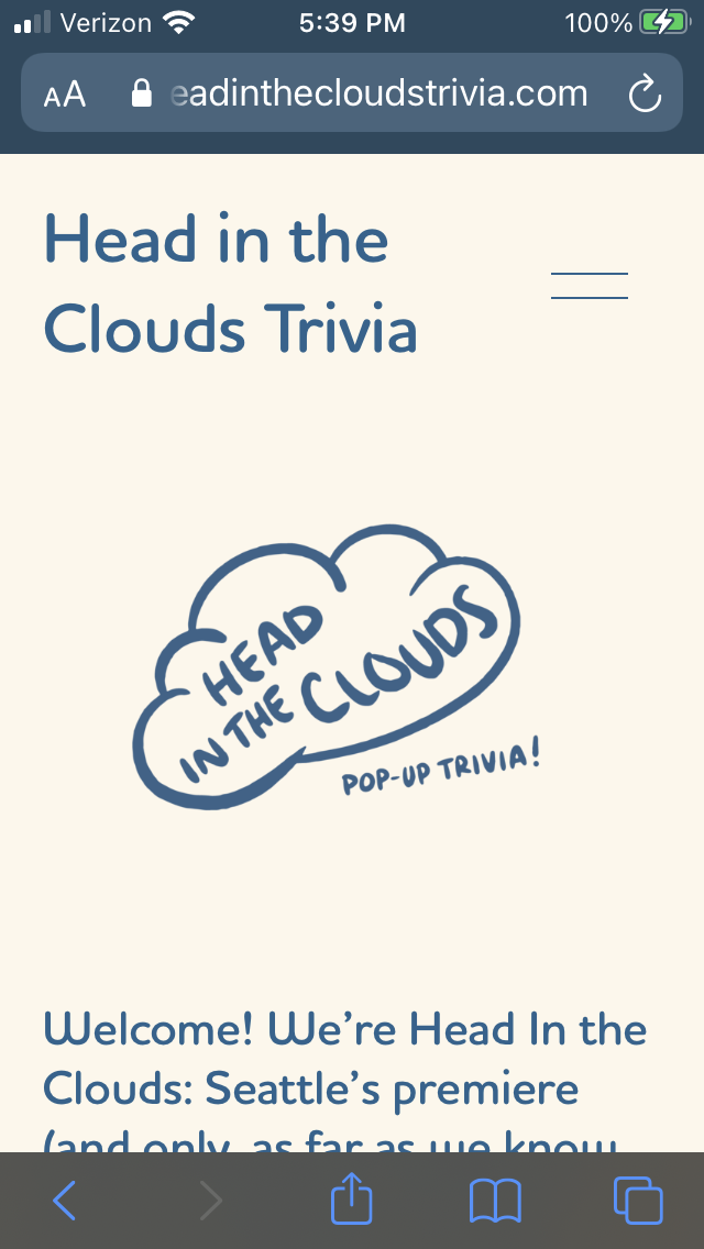
Website
Here are just a couple of screenshots from the website. The site can also be visited live by clicking the link below.


Mobile
The mobile site has a touch of pink in the menu.

Head in the Clouds Brand Book
This is a style guide for the client to use as they will likely be building a lot of their own marketing and trivia assets. I built this brand kit to be user-friendly and adaptable. This business is new and they are likely to discover many opportunities and so this identity package is built with playfulness and growth in mind.


